Monday, September 5, 2016

Goodbye Labor Day Weekend

Just a couple more cards I was able to finish this Labor Day Weekend. It was so nice having a 3-day weekend.


This card uses retired Stampin Up stamps. Who cares? They are so pretty. There is a big background toile that I don't even remember the name of, the flower from Still Life Stems, and overtop of everything is the Linen background stamp. So beautiful! I stamped, sponged, and colored with Copics. The corner dies are by Marianne.


And here is a card that started entirely with the background. I was playing with alcohol inks on a piece of acetate. Somehow I thought it would be good to paint the back of the acetate  with metallic pigment inks. This was not a good idea as I discovered the following day that it was never going to dry. So I poured some clear embossing powder on it and heated it with a heat gun. I was suprised that it didn't warp more than it did.

So then I die cut it, and finally tonight, after trying several things with it, decided that copper leaves would be cool. These leaf dies are from Spellbinders, and the "thanks" is from Karen Burniston for Elizabeth Craft.

Tomorrow I have to go to work. Kind of sad. But it will be good to get back to a routine.

Cyndi

Sunday, September 4, 2016

Fall Accordian Card

On Splitcoaststampers today, the "Featured Stamper" is a very talented lady named Marg Mortimer. We were challenged to pick a card from her Splitcoast Gallery and do our take on it. Here is the card that Marg crated which is the inspiration for my card:

And here is the card that I made. As you can see, I reimagined it as an accordian card.


First I die cut three panels from Karen Burniston's accordian oval die. Then, just like Marg, I made my own stencil. I used a corner leaf die from Marianne Designs (I think Marg used a punch, but same difference). Then I airbrushed the stencil in each of the corners of the previously die cut using a Copic W9 marker.

I also used Marianne leaf dies and Karen Burniston oval dies to cut out a leaf window for each oval. Then I airbrushed the background for the leaf windows. 


I airbrushed another panel and then stamped and gold embossed leaves, which I fussy cut out.


Thanks for looking!

Cyndi

Saturday, September 3, 2016

Sunflower Birthday Card Redo

I don't think I've ever done this before - change a card and repost it - but I was not happy with the faux stitching on the card from this post.  It was too heavy and way too crooked. Too heavy because I think the white gel pen I was using was too juicy. Too crooked because - that was totally my bad.

So I got my sewing machine set up again after years and a move. In fact when I first plugged the machine in last night it immediately began to run. After a series of plugging and unplugging and wiggling wires, etc., I discovered that when I pressed the pedal of the running-at-full-speed machine, the light would come on. Duh . . . I had the plugs crossed.

Then there was a lot of jamming of the bobbin thread, which precipitated my discovering that I forgot how to properly thread the stupid thing. 

Finally . . . success!


As you can see, I also changed the background of the "Tip Top Taupe" layer.

But also, it turns out that the Splitcoast Stampers color challenge this week is "Cajun Curry and Chocolate in the Garden." So I redid the card in those colors as well. Plus I made the sunflower bigger. Which is one of the joys of digital stamps.


For this card, I colored the sunflower with Copics, and these are the markers I used to come closest to Cajun Craze, Curry Crush, Garden Green, and Chocolate.


Thanks for looking!

Cyndi

Wednesday, August 31, 2016

Sunflower Birthday Card


This is a card that I made for my friend Natalie's birthday.

It also happens to combine a couple of challenges. One is the Copy, Steal, Inspire challenge over at Power Poppy. And boy did I bring this one in under the wire. The card that I was inspired by is right here. It was created by Tosha Leyendekker.

http://powerpoppy.blogspot.com/2016/08/apples-in-season-digi-remix-august.html


The other challenge is actually a Splitcoast tutorial, and it's something that I used to do quite a bit of back in the day, but I hadn't done it in a long time: Palette Blending.


Basically palette blending is scribbling your regular water-based markers onto a piece of plastic or other smooth surface and picking up the marker ink with a paint brush.


Okay, I got a little fast and loose with the faux stitching, but look at the layers on that Power Poppy sunflower!

Happy Birthday, Natalie!

Cyndi

Sunflower Birthday Card

This is a card that I made for my friend Natalie's birthday.

It also happens to combine a couple of challenges. One is the Copy, Steal, Inspire challenge over at Power Poppy. And boy did I bring this one in under the wire. The card that I was inspired by is right here.

The other is actually a Splitcoast tutorial, and it's something that I used to do quite a bit of back in the day, but I hadn't done it in a long time: Palette Blending.


Basically palette blending is scribbling your regular water-based markers onto a piece of plastic or other smooth surface and picking up the marker ink with a paint brush.


Okay, I got a little fast and loose with the faux stitching, but look at the layers on that Power Poppy sunflower!

Happy Birthday, Natalie!

Cyndi

Friday, August 26, 2016

Bird on a Sign

It has been a long time since I played along with a challenge over at Splitcoaststampers, but it's really fun for me when I do. This week I thought I would use the sketch challenge as my muse, particularly Sketch Challenge 607. Here is the sketch:


And here is my card!


I started out by making a background. I used some fall leaves on the edges in Dapper Denim and Always Artichoke ink (Stampin Up's alliterative color names), and then stamped a French script background. All of these stamps are retired.


Maybe my favorite element is this brick. I used a brick embossing folder and then just dragged Crazed Cajun, Real Red, and Cherry Cobbler ink pad across it.


This bird is from the Best Birds SU stamp set. As you can see, I airbrushed him with Copic markers. This is an unbelievably quick way to color something, but it only works if you are going to cut it out. I have the die that matches this stamp, but it doesn't cut as closely as my scissors.


I worked and worked  with an entirely different background for "Panel 6" (see above), and I just couldn't get one that would look awesome with this bird. So I browsed through my dies to get some inspiration, and I found it! The sign holder was cut from black paper and then I used some metallic rub-ons. The sign itself was cut out of white cardstock, the frame was colored black with a black Copic marker, and then the same metallic rub-on was applied. The stamp is from SU's Established Elegance stamp set.


Then I put it all together.  I'm going to go home tonight and see what other Splitcoast challenges strike my fancy. That was fun!

Cyndi

Monday, August 22, 2016

Pop It Ups Designer Challenge - Girly or Ghouly


I am honored and flattered to be asked to participate as a Guest Designer for Karen Burniston and her amazing Pop It Ups dies. In addition to being honored and flattered, I am totally psyched about this challenge. Shelly Hickox (who totally rocks in all ways) has chosen as the theme for this challenge "Girly or Ghouly." The designers are asked to chose either a girly theme or a ghouly theme and make a card. But I was thinking . . . why choose? How could I make a card that embraced both the light side and the dark side.
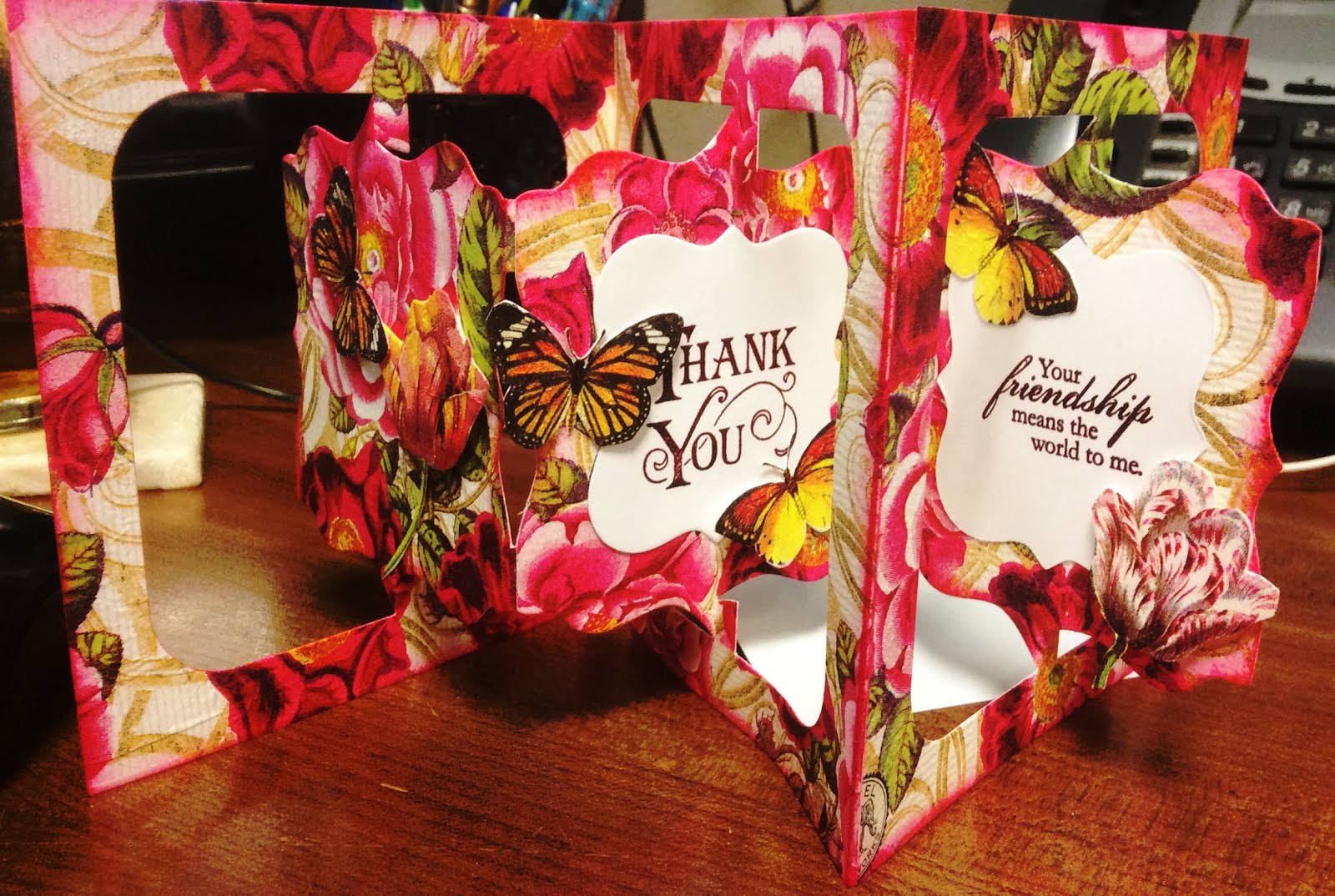
I had created a staggered accordian card for a friend's birthday a few weeks ago, and I thought I would like to try my hand at another staggered accordian card. The thing with accordian cards is they usually have a pretty side and a plain side (with the exception of the front panel, which can have two sides). I tend to write my greeting and sign my name on the boring back side, and leave the front side to be displayed by my friends for months on their mantles or bedside tables until they deteriorate with age. (I like to imagine my friends never throw away cards I make for them.)

And here is the link to the instructions that Karen gives for a staggered accordian card.

Anyway, here's what I made:


The "Girly" side:


What little girl doesn't like dressing up for Halloween and gathering as much chocolate as she can carry? It's in our DNA.


The "Trick or Treat" sentiment is by Stampin Up, and the girl with the pumpkin is a stamp from Oxford Impressions.


This little girl in the witch's costume is a stamp from Artistic Outpost as is the butterfly stamp. I don't know if you tell from the photo, but the moon and the butterflies were painted with Wink of Stella.


And finally the third panel . . . oh wait. What is that peeking from behind the third panel with its gnarles branches. It looks like a segue to . . .


The "Ghouly" side:


While the "girly" side was very stampy, the "ghouly: side has some amazing new Halloween dies from Karen Burniston. Let's break it down for a closer look:


Again, the "Trick or Treat" stamp starts us off. Look at those great dies at the bottom. The tree is actually behind the cemetery, and the cemetery is bowed just a little bit to give it some depth and dimension. They are both from the Halloween Scene die set. (Note how I put some white Wink of Stella on the grave stones to reflect the moonlight.)


The bats are also dies from the new Halloween Scene die set. Where I had pretty butterflies on the "girly" side, I have bats on the "ghouly" side.


I also wanted to show you a close-up of the moon, which stands out better against this black background. I wish you could see the Wink of Stella that makes this really shimmer. Oh well.


The final panel has a couple of things going on. Up at the top of the card, there is a spider hanging from a spider web from that same Halloween Scene die set. I cut the spider web die cut in half because I only needed part of it. I also stamped the spider twice so I could glue a piece of thread--I mean "web" --between the layers.


At the bottom of the panel is the fence from the brand new Iron Fence Pop-up die set. This time I used the fence flat on the card, but you should check out what else this fence can do. Next time . . . next time. The bird (raven?) is also from the same die set.

See that green bush that the raven is in front of? That is actually the back side of the girl holding a pumpkin. Which brings me to my confession.

I actually should not have anything where I have the girl holding the pumpkin because it hinders the moving part of that panel from folding absolutely flat. However, this card has so much stuff in it that it's never going to fold flat, and it's so pretty that it will not need to go into an envelope. (Because I'm keeping it!) But please keep that in mind if you make an accordian fold card that you want to send to someone.


Here is how the two sides of the card would look sort-of folded. Note that the Girly background shows through on the Ghouly side and vice versa:


The Poem:

The verse that is in this card, the Halloween poem, was written just for this card! (I needed a unifying theme.) Feel free to use it in your Halloween cards if you like, but (obviously) if you post it anywhere, please give me credit. Here it is all put together:


Lastly, I thought you might enjoy seeing how I built up the background paper for the girly side of the card.


I started with a tiny acrylic stamp in the MISTI, See how I marked the grid on the top (outside) of the MISTI. That way I knew exactly where the stamp would go every time. I placed the stamp where it needed to be, and then stamped all three background sheets, one at a time. Then I moved the stamp to the next position and stamped all three backgrounds again. This was the first time I had tried this with my relatively new MISTI. I could not believe how easy this was!


And then I had three identical backgrounds, which are supposed to be reminiscent of Victorian walpaper, or something like that.


I randomly stamped Oxford Impressions stamps in the purply color and then airbrushed green and pink with Copic markers. So much for Victorian wallpaper.


Then I stamped, in green, a linen background stamp to give it a deeper green color and some great texture. Finally, I white embossed some Stampin Up leaves and flowers.


The ghouly background was easier, yet way messier. I basically used the wrinkle-free distress technique with reinkers and a spray bottle on watercolor paper, but then while the paper was still wet I added some teal and purple shimmer sprays. This card has some shimmer to in real life. It took a while to dry, but I let it dry naturally so the shimmer would be as shimmery as possible.


That's it. I hope you liked my card. Many thanks to Karen Burniston who asked me to serve as a guest designer for this challenge and to Shelly Hickox for coming up with such a great theme. I had a blast!!! Thanks, Karen! Thanks, Shelly!

Cyndi


Sunday, July 31, 2016

Pop-It-Ups Challenge: Stretch it Out

Wow! It has been forever since I posted anything on my blog. Shame on me!

Luckily I was inspired by a recent challenge on Karen Burniston's blog to "stretch it out." Karen Burniston is the designer of the Pop It Ups die line from Elizabeth Crafts.  Recently some friends of mine and I got together to create some accordian cards using napkins as a background. Those accordian cards were so much fun to make, and it turns out that napkins make gorgeous background paper with a very cool texture, similar to fabric.


I should do a separate post on these sometime. As you can imagine, this accordian-type format for a card makes an amazing display on any friend's fireplace mantle or entry hall table. (I like to imagine my friends putting cards I send them in places of distinction.)

Back to the card I just made, however, it was inspired by this blog post by Karen Burniston to make an accordian card, along with a tutorial for a STAGGERED accordian card. Here is my version.


I chose a pad of paper from Prima Designs that I have been hoarding forever called "Lyric." It's so pretty and feminine.


It's my new goal to do more fussy cutting. I know that is very counter-culter in the papercrafting industry right now with all the cool dies that go with the cool stamps, but fussy cutting produces great results, especially if you are cutting patterned paper. So I fussy cut the roses you see above, painted the roses themselves with Wink of Stella (ultra-fine glitter in a tube applied with a brush), and put a half-pearl sticker over each and every baby's breath blossom. I wish you could see the shimmer of the Wink of Stella. Trust me that it's lovely in real life. In fact, every rose on the entire card is painted with Wink of Stella.


For the window, I branched out from Pop It Ups dies and used a Sizzix die for the window and a Cheery Lynn die for the outside of the frame. I was delighted at how these two dies worked together.  I dug through my stash and found a bead with another bead on it, and thought it was a good complement to the Lyric paper. The butterfly is also painted with Wink of Stella.

Confession: I added this window to the card kind of late in the game. In fact, I had already attached all three panels to each other. And then when I die cut it . . . it was not centered as well as I had hoped. The butterfly was added to trick your eye into thinking that this was a well-constructed card.


Look at that! I not only fussy cut, but I used a "paper tole" technique, which is a fancy way of saying I made several layers and put pop dots between them. I even curved the rose petals a little.


Although these accordian cards are all about being "open," you have to put a front on the closed version so the recipient of the card is not bewildered when she takes it out of the envelope.

I hope you liked my card, and if you have a chance, check out Karen's tutorial.

Cyndi